Comparison MSI Interceptor DS4100 vs Logitech G213 Prodigy
Add to comparison | 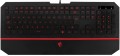 |  |
|---|---|---|
| MSI Interceptor DS4100 | Logitech G213 Prodigy | |
| Outdated Product | Compare prices 28 | |
| User reviews | ||
| TOP sellers | ||
Wrist rest. : 620 | Zone lighting. Laser engraved keys. Logitech G HUB software. Mech-Dome switches expertly recreate the feel of mechanical switches. Water protection. Block of multimedia keys. Hand rest. | |
| Connection | wired | wired |
| Cable length | 1.8 m | 1.8 m |
| Type | for game | for game |
| Form factor | 100% (full size) | 100% (full size) |
| Layout | ISO | ANSI / ISO / JIS |
Keyboard | ||
| Key profile | low | high |
| Key type | island type | classic type |
| Switch technology | membrane | membrane |
| Additional keys | 9 | |
| Anti-Ghosting | ||
| #KRO | 6-KRO | |
| Fn key | ||
Features | ||
| Cyrillic colour | transparent | |
| Application of symbols (Latin) | laser engraving | |
| Volume control | fn | add. keys |
| Palm rest | + | + |
| Game mode | ||
| Lighting | multicolor | RGB |
| Lighting effects | + | + |
Connection and power supply | ||
| Cable | USB-A | USB-A |
General | ||
| Waterproof | ||
| Size | 452x218x33 mm | |
| Weight | 1000 g | |
| Color | ||
| Added to E-Catalog | july 2017 | october 2016 |
Compare MSI Interceptor DS4100 and Logitech G213 Prodigy
Price comparison
You may be interested in
MSI Interceptor DS4100 often compared


Logitech G213 Prodigy often compared


Glossary
Layout
The layout describes the physical geometry of the keys and their standard arrangement: the shape of Enter and Shift, the presence of additional keys, the width of the space bar, and consequently, compatibility with keycap sets and typing familiarity. The standards hardly affect productivity in software and gaming — comfort and how easy it is to find suitable keycaps/cases are more important. The following types are found:
— ANSI (American). A distinctive feature of the American layout is the single-row Enter key; it is the only popular layout where this key occupies one row, not two. Additionally, unlike the European ISO, the Shift keys on ANSI keyboards have the same width, and the Alt key has the same function. The backslash “\” is usually placed above the Enter and can be longer.
— ISO (European). One characteristic feature of the European layout is the Enter key, which occupies two rows and is slightly wider at the top. Also, the modifier keys are asymmetrical: the Shift keys differ in size (the left one is shorter than the right), and the Alts differ in function (the right Alt is marked as “Alt Gr” and is used for typing special characters of European languages). From the similar in many ways "Japanese" JIS layout, the ISO layout differs by the placement of the backslash “\” — it is standardly located near the left Shift (in some models, it is duplicated near the Enter). As a result,...the left Shift is shorter than usual; this can be inconvenient, especially for new users.
— KS (Korean). The “Korean” layout can be distinguished by the characteristic shape of the Enter key: it occupies two rows and is longer at the bottom than at the top. Another feature is the backslash “\”, which is located to the left of the Backspace, resulting in a shorter Backspace than in other layouts.
— JIS (Japanese). A layout much like the European ISO: it has the same two-row Enter with an increased length of the upper half. In many models, the right Alt is labeled “Alt Gr” and is designed for typing special symbols. The main differences lie in two aspects: the length of the left Shift (it is standard in JIS, not shortened) and the placement of the backslash “\” (it is standardly installed to the left of the lower half of the Enter, where some ISO keyboards have a second, additional backslash).
Key profile
The distance that the key travels when pressed — from the initial position to touching the contacts and sending the "command". Indicated as high or low. Keyboards with low key travel(3 mm or less) are considered to be more comfortable for fast input (such as fast typing). However, the best option largely depends on the habits and preferences of a particular user.
Key type
— Classic type. Keyboard with keys of the usual square and rectangular shape, with a small distance between them. Such keys usually expand downwards so that the gaps between them are as small as possible.
— Island type. Also known as "soaring" or chiclet. This is a keyboard in which each key is installed in a separate hole at a small distance from the others. Island models are more convenient than classical ones in that they are less likely to accidentally press the adjacent key. On the other hand, they are more difficult to clean: debris that has clogged into the gap between the key and the “board” itself is quite difficult to clean out, while contamination can create problems in operation.
On the practical side, the choice of a particular type of keys depends primarily on the personal preferences of the user.
Additional keys
The number of additional keys provided in the design of the keyboard.
Such keys do not belong to the standard layout and are intended for quick access to specific functions or individual applications — for example, to control the media player or open mail with one click. This function is convenient because commands from additional keys are usually recognized by the system regardless of what is on the screen — thanks to this, for example, you do not have to close the text editor to switch tracks in the player.
Note that in this case we are talking about individual keys that have a strictly defined purpose and corresponding markings. Programmable buttons, the Fn key (see below) and the functions of the main keys implemented through Fn are not taken into account in this paragraph.
Anti-Ghosting
Technology aimed at neutralizing phantom button presses in keyboards with gaming ambitions. The function allows you to simultaneously press numerous keys without false positives of adjacent buttons — a similar situation often occurs in membrane keyboards due to their design features.
#KRO
A parameter that determines the maximum number of simultaneously pressed keys, the signal from which the keyboard is able to process and transmit to the computer. Instead of the "lattice" symbol in the abbreviation KRO, a number is indicated showing the allowable number of simultaneously pressed buttons. Most membrane keyboards come in the 2KRO and 3KRO grades, mechanical models usually start at 6KRO. The NKRO marking says that it is possible to issue a signal from an unlimited number of keys in one sitting.
Fn key
The presence on the keyboard of the Fn key(short for function). It belongs to modifiers, similar to Shift or Ctrl: by itself it does not perform any action, but when pressed simultaneously with another key, it changes its original purpose. Fn is often found in compact keyboards (see "Format"), but can also be set in full-sized ones. The features it provides include quickly changing the screen brightness or sound volume directly from the keyboard, using the centre keys as a Numpad, launching individual applications, and so on. Specific features of using the Fn key depend on the keyboard model.
Cyrillic colour
The colour of the Cyrillic letters printed on the keyboard.
This colour is usually chosen so that the letters are clearly visible. This point does not affect the functionality of the keyboard, and the choice in this case depends mainly on personal preferences. However, there is also a practical point: for inexperienced users who have not mastered touch typing, it is desirable that the letters stand out as much as possible against the background of the keys.
Transparent letters are a separate case — they are used in keyboards equipped with a backlight (see below), due to which such characters, when the backlight is on, are visible even in the dark.
Application of symbols (Latin)
Legend application indicates how the Latin characters on the keys are made and how well they will survive years of heavy typing.
— Double-shot. The keycap is molded from two different plastics: the main “body” and a separate legend insert are formed together in a single mold, so the letters don’t wear off or fade at all. This method is ideal for RGB backlighting: if the legend layer is semi-transparent, light passes through the symbols without halos. ABS double-shot is more common (bright glow, pleasantly smooth feel), while the pricier PBT double-shot is rarer and offers higher surface wear resistance. Compared to laser engraving, the lifespan is an order of magnitude higher, and it beats the dye-sub method for backlighting (dye-sub doesn’t shine through). Downsides include cost and sometimes visible seams/thick walls that can affect the click’s sound profile. In practice, these keycaps are in demand for mechanical gaming keyboards, esports arenas, developers, and frequent hotkey typing—where double-shot keeps legends readable for years.
— Sublimation. A method of applying Latin symbols to keycaps where, under heat and pressure, the dye penetrates the top layer of plastic, creating a durable, “absorbed” legend. The print won’t rub off from fingers, resists household cleaners and UV light, preserves a matte texture, and maintains high contrast on light backgrounds, but it doesn’t let RGB shine through the symbols and is limited in palette. Compared to laser...engraving, it offers higher lifespan and readability, and versus double-shot it only loses in shine-through effects. Typical use cases include mechanical keyboards for typing, developers, and office work, where durability, the tactile matte PBT feel, and stable readability over years matter.
— Laser engraving. Burning/removing the top coating layer with a beam to form highly precise symbols. Legends last for years, but over time the fill paint can wear and contrast can drop in high-contact areas. Advantages include thin typefaces, clean contours, RGB compatibility, and low cost. Compared to double-shot, engraving is cheaper and more flexible in design, but not “forever”; versus dye-sub it wins on backlighting, but loses in tactile uniformity and longevity. Typical applications are mass-market office and gaming models with backlighting.